Top 5 Android P Features | Tech

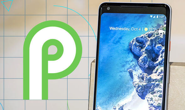
Hey, what’s up guys this is Khalil here and welcome to the latest ninth version of Android OS developed by Google. It’s one of the incremental updates again but it makes sense as they are refining android phones for better use. We will have a look at the top 5 best & new features of Android P that really attracts people. Micheal John just wrote the perfect guide about Functions Android smartphone possesses.
(1) New visuals overall
If we talk about Android P new visuals, the first thing that attracts me is the arrangement of Clock. The Clock is on the left corner now, I am talking about this because in previous versions of Android it was on the top right. Now the visual clock becomes dark in light Wallpaper and light in dark Wallpaper.
The Home Buttons are still on bottom but this time its visual in white color that’s pretty good.
The App drawer has more defined dock instead of gradient shade behind it so it is more obvious but it is minor in the notice.

(2) Quick settings on top
The second new change is a quick set on the top bar. The quick settings’ icon colors are blue and white that is more beautiful than previous Android versions. The top setting theme has smooth corners and edges.
You can’t long-press to expand these toggles anymore, quick settings are supposed to be quick it’s just a one press toggle – long-press to wifi it will show a bunch of available networks, quickly explore a bunch of Bluetooth devices but in my point of view, I don’t like that.
(3) New Volume Control
The new volume control bar on the screen, my favorite change overall, is very enchanting to me. Pressing the volume buttons adjusts the media volume by default so that’s pretty sweet.
Lost Images Data? No Problem! This Photo recovery Software won't let you tears UP
It has a bar in the right-center instead of a huge bar on the screen that is more pretty change and volume bar goes up and down instead of going left and right so now it matches the volume button on the phone that looks pretty natural.
There is a button at the bottom of volume bar to switch between ringer, vibrate mode or silent or volume on – the arrow of the top of volume button shows the connected devices as some Bluetooth speakers, wifi headphones or car Bluetooth speakers. I like this layout overall.
(4) New Setting App
Another big change in Android P is in each setting there are icons of different colors on the left side so that you can quickly press the setting you want. The overall experience is pretty clean, search bar looks cleaner and a keyboard has many magic features.
(5) New Developer Preview
New support in the developer mode, the indication of our future advance technology makes Android P better for Developers. Simply go to settings then display themes: there is actually a couple of different themes that simulate a notched at the top of the phone.
Developers can see what their app can look like on a phone that actually has a notch, everything still work, layout properly, a small narrow notch on the phone small-medium even the big unibrow one like iPhone 10 has the exact the notch. It’s weird to have a virtual notch on the top but this is a developer preview and is for developers to make their app to support the phone like those phones that have notches in them.
Other New Features:
The new Android version focuses more on security – background apps cannot use microphones, cameras, and other hidden features. We don’t know the meaning of the ‘P’ in the new Android. The fingerprint sensor is on the back but I don’t like this change.


